It’s been more than a year since I moved to a Jekyll blog hosted on github. I think I have never been so productive in this period of time, despite having a much busier life both at work and off-work (Valentina is here and she’s here to stay! We have now trespassed the 15 months mark, if she was a car I’d say we have a looser engine now — and it shows from the way she runs and skettles; she is just unstoppable).
I have spent however far too much time adjusting the way this site looks, and I am never satisfied. I have a designer’s eye but a designer’s skill definitely not.
I have googled the net and finally I have landed on something, a “responsive” (whatever that means in nerdish) theme, that even with my limited web skills, was actually easy to install on my jekyll blog.
The theme is called So Simple and I like it because is clean and refined. I like it so much that I haven’t changed anything — and I would like to keep it that way. I mean, let’s focus on the content!
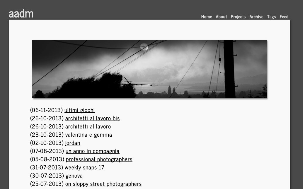
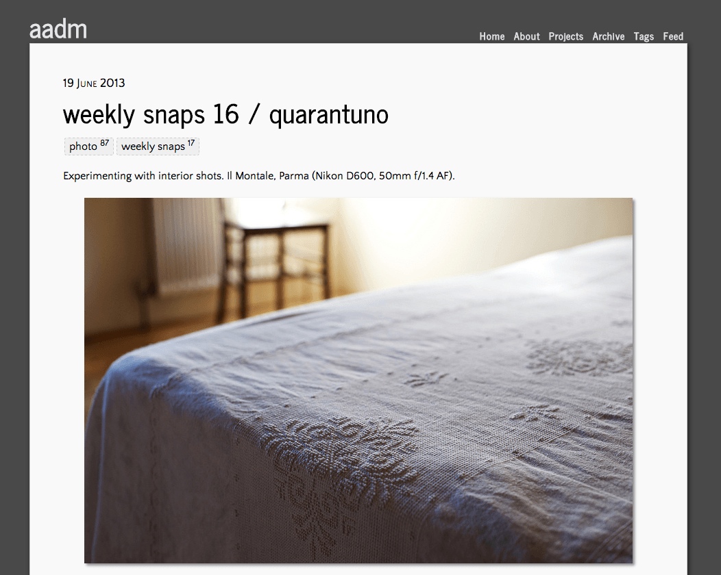
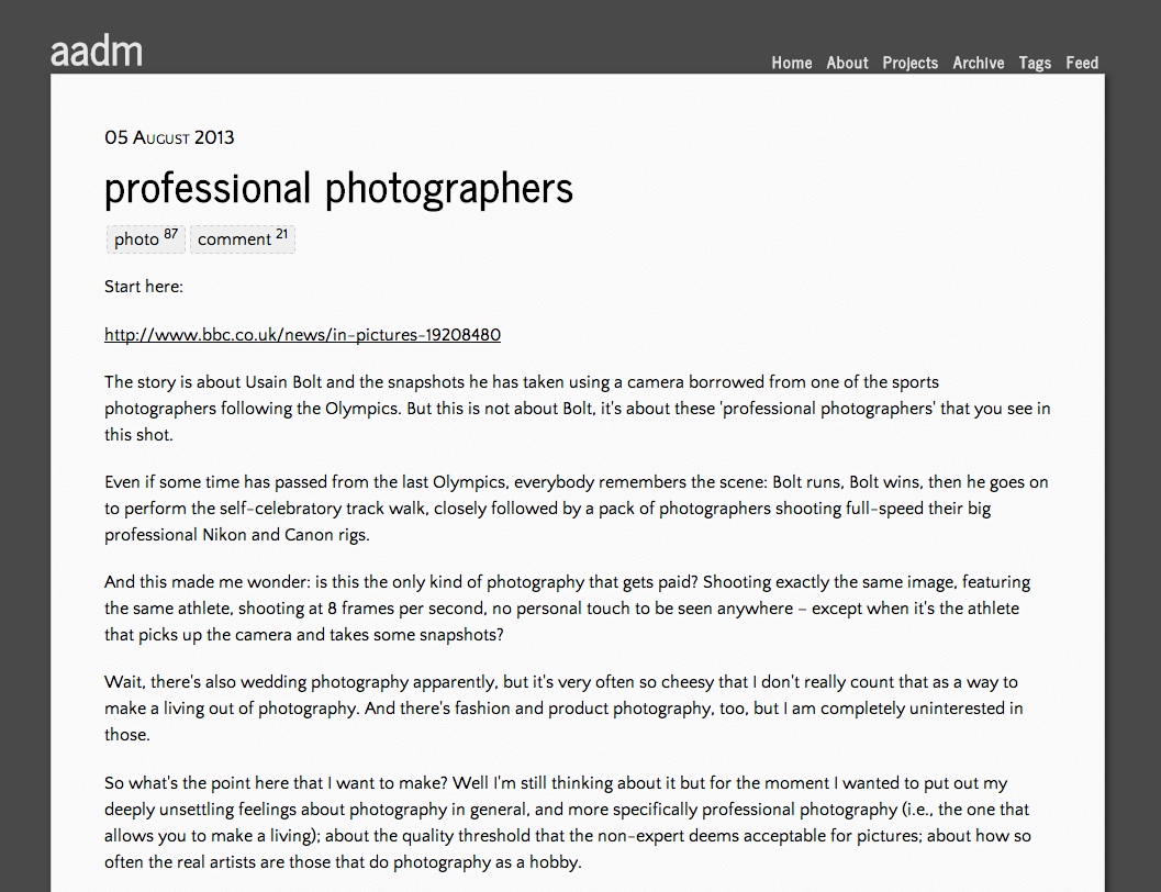
So there you go. This is the new look.
And here’s what this site looked before:


